Sand
September 2019 – October 2019
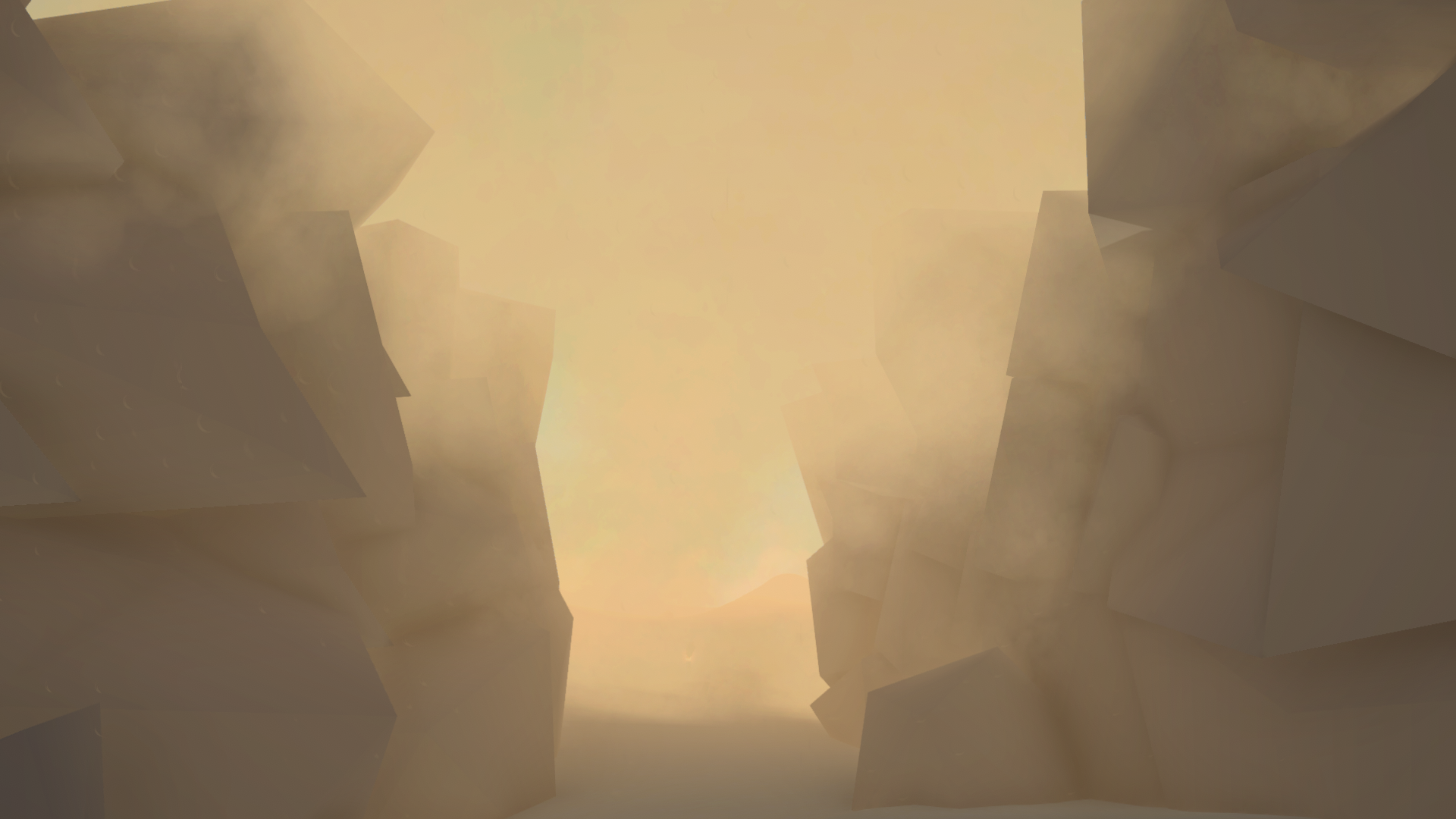
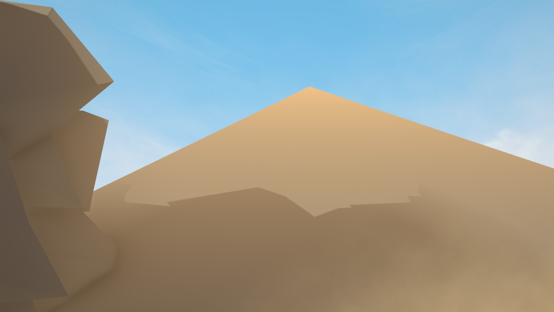
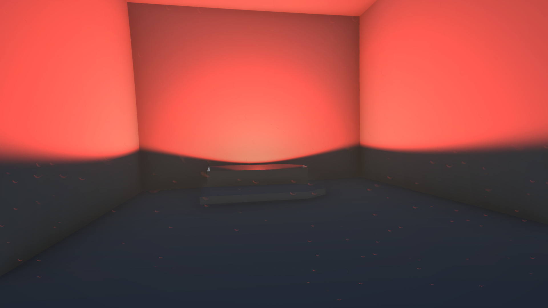
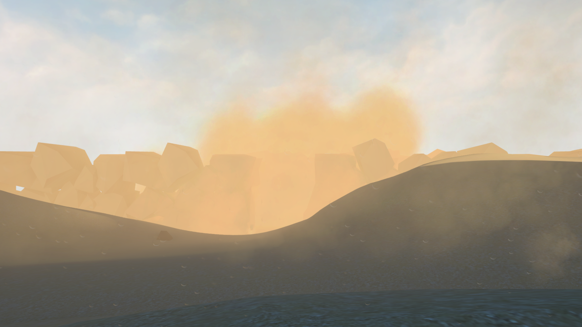
Sand is a short, atmospheric walking sim created in 6 weeks as a solo project. The task of the project was to create a level that guides the player to the end without the use of any text. The game is about an unprepared traveler who is lost in a vast desert without any water.
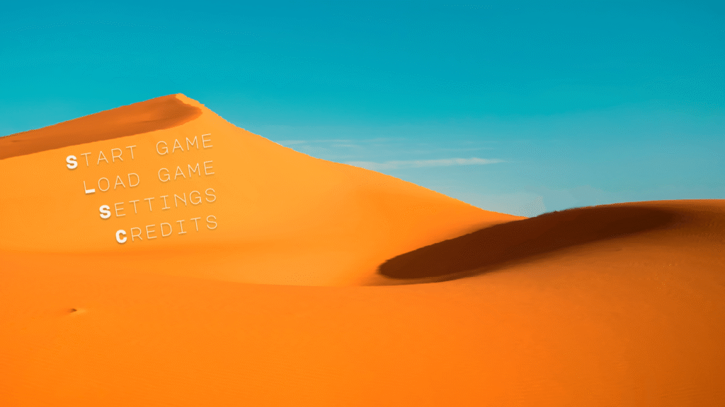
Main Menu Wireframing
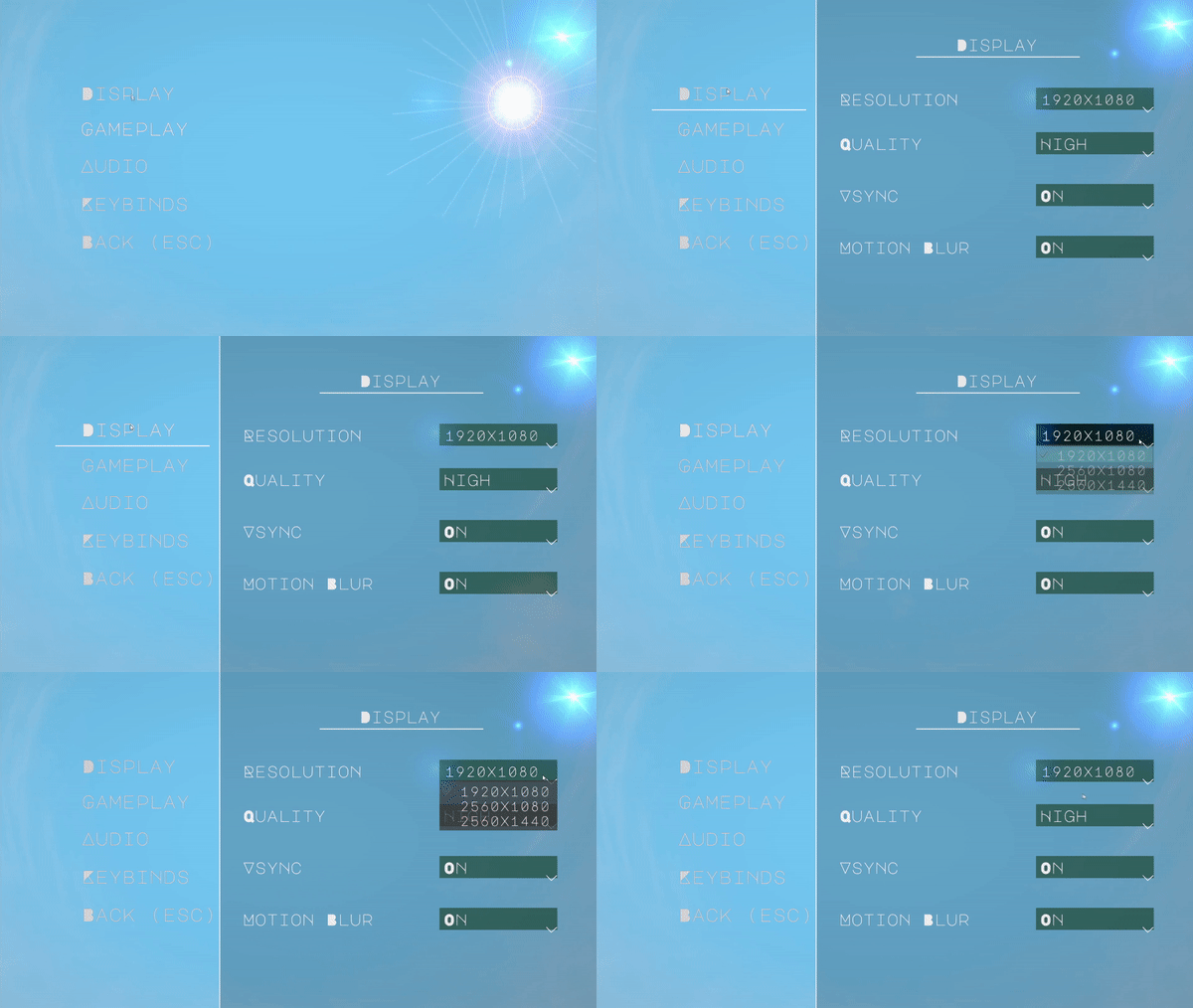
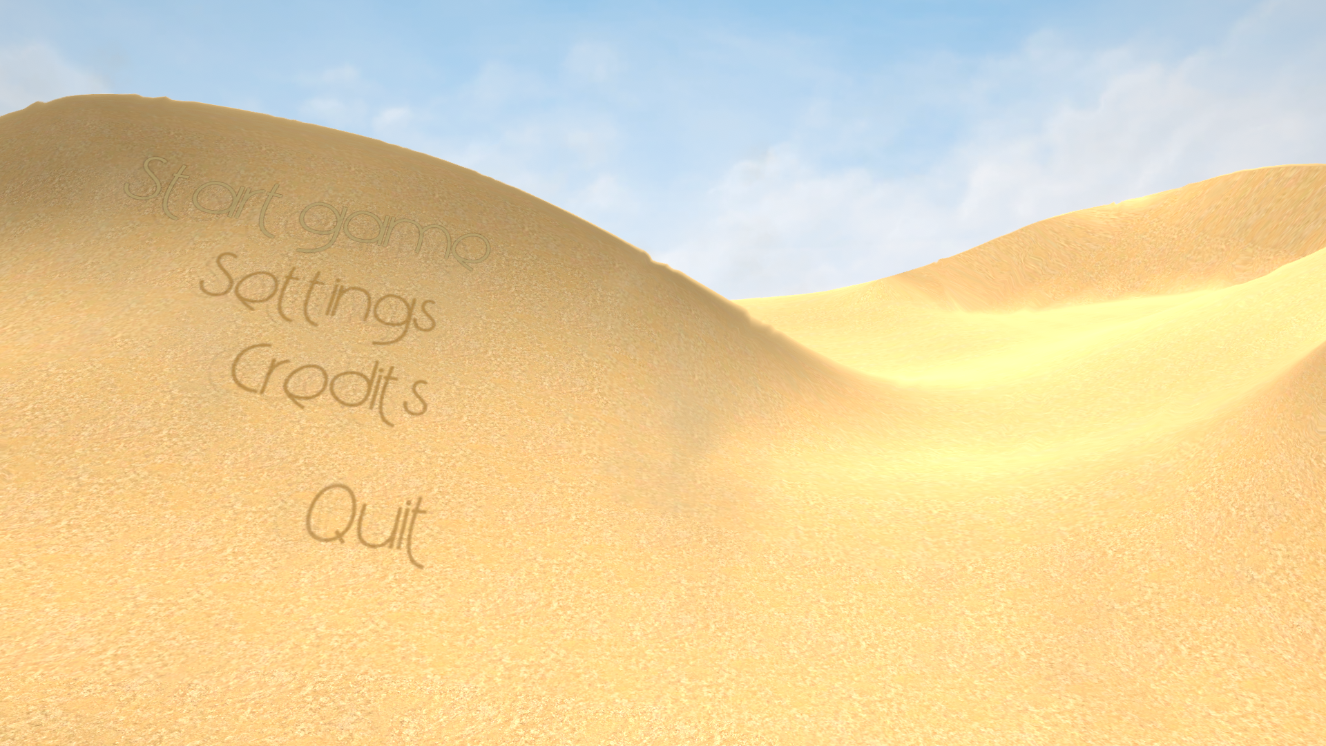
For the main menu screen, I attempt to evoke feelings of being alone in a scorching desert. I render the menu as a 3D scene in Unity, with the text options appearing in-line with the dunes. The selected text acquires a bright glow effect, while other options oscillate between two intermediate levels of opacity (for example, 40-80%) and slowly shift positions. The purpose of this effect is to play into the hallucinations that occur within the game by making the text appear ephemeral. When the player selects an option on the main menu, I dissolve the text and animate it as if it’s being swept away by the wind. I also incorporate a heat wave effect over the scene, which is what the blurred and shifted lines in the prototype signify. The sound effects are inspired by the UI soundscape in Shadow of the Colossus. They are deep and hollow, like blowing into a large pipe or wind instrument. They convey the feeling of emptiness that one can feel in a barren place far from civilization.
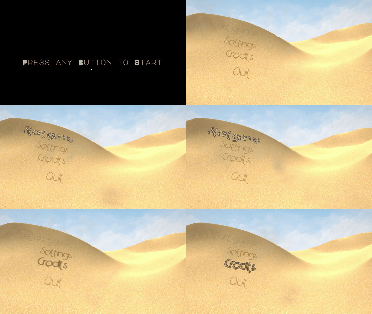
Settings
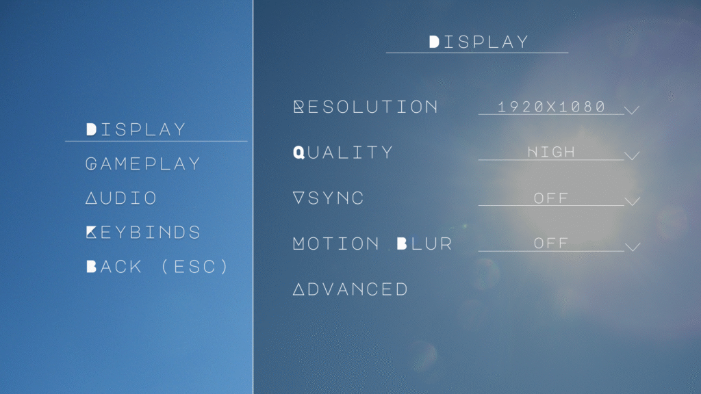
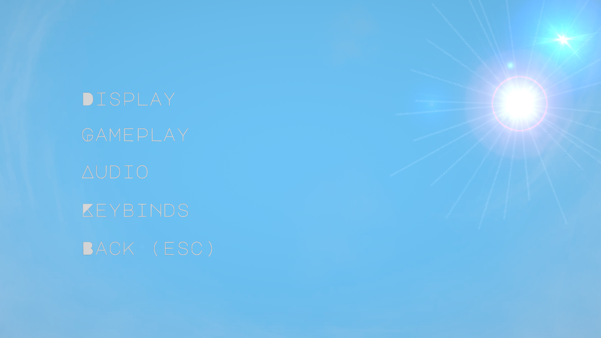
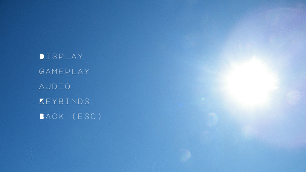
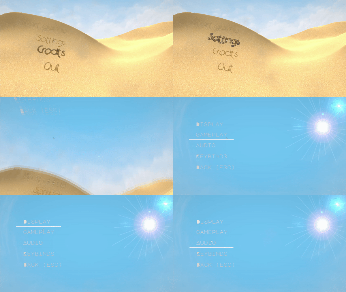
Upon selecting the settings button, I made the camera rotate 90 degrees on the y-axis and move downwards, as if the viewer is falling into the sand. The camera then looks at the sky, with a hot sun beating down. The sky serves as the backdrop for the settings menu. The main sub-menus live on the left third of the screen, with the sun being on the right third. When sub-menus are selected, the options for those menus appear on the right 2/3rds of the screen, with a darkened panel below them so that they are easily visible against the sun. Since the sub-menus are still visible when a sub-menu is open, players can move between sub-menus without returning to a central menu. For the options themselves, there are drop down menus, sliders, and boxes. I’m intended for this game to be playable only with mouse and keyboard, so drop down menus work better than the arrow style of multi-selection that is seen in titles like Alien: Isolation. The sliders have input boxes as well, as that is often more convenient for players using mouse/keyboard.
For the pause menu, I have the character exhale and use an effect that looks like the character is closing their eyes (black comes in from top and bottom of screen). The Resume, restart, settings, and quit options appear here. Behind the text I intend to have a highly transparent brown dust effect moving around to add some dynamism to the menu. Upon resuming the game, the eye closing effect reverses (also known as eye-opening), and the game resumes. As a note, going into settings from here would not have a camera panning effect, since there are problems regarding the player’s positioning when this occurs.
